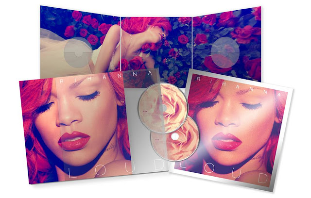
This professional digipak for Rihanna's album "Loud" especially caught my eye.
Artist Image:
As Rihanna is used on the cover it will immediately draw in her fans because of her established popularity they will recognise the face. Her bold, fiesty red hair is definately what will make her stand out from other artists when retailed as well as her calm facial expression which can show she has the attitude that everyone knows her for. Also, by showing her tattoo on her neck indicates to the audience she still has the wild side and bad girl elements which she relates through to her song lyrics.
Colour Pallette and Imagery:
I believe the red colour scheme has been chosen throughout this digipak of the album because Rihanna has incorperated a new look what with her hair. The red roses contrast well agaisnt the artists skin in the large photo and also make the whole scene bolder and eye catching which is exactly what people look for in the album artwork. The images that have been used agaisnt this strong colour scheme reflect to me themes of love and lust which give an insight into what is to feature on the album. This can be emphasised by the way her eyes are closed which makes me think she could be dreaming about something or someone.
Genre:
The genre of this album is indicated by facial expressions of the artist, especially on the large cover at the back showing her with her eyes closed which indicates to be she is embracing the music so it then makes me think each song means alot to her and alot of thought has gone into them. However the genre is only obvious to me because I am a fan of this artist and I know all of her music in the past has been R&B based so this one will just follow in them footsteps, but without my background knowledge of Rihanna this album cover gives nothing away linking specifically to the genre. The front cover creates imagery of Rihanna looking more girly and sweet than her previous digipaks and this may be due to wanting to portray another side to the artist.
Visual Narrative:
The only storyline I could relate to this album artwork is what I have just been talking about in the images, the love and lust. In the main album cover the artist looks lost in her thoughts but in a positive way with her hidden eyes which could show she is thinking about that one person. However, in the larger photo her body language and facial expression suggests shes has more of an attitude which can constrast the beauty of the pictures. The use of roses in the images can suggest Rihanna has suddenly turned alot more feminine than when compared to her previous album "Rated R" where she was seen as more of a rockchick. This element can shows her fans how diverse she can be as an artist.
Font and Composistion:
The font that has been used on this album cover is very plain and simple and I believe this is because they didn't want to take all the attention away from the artist photo. I think the colour white works well, as it is subtlely present but takes a background role. It has also been posisitioned at the top and bottom of the album rather than in the middle which works well to draw attention to the central photo.
No comments:
Post a Comment